Monet: The book Techniques of the Impressionists (ref: Anthea Callen 1988 Techniques of the Impressionists. Richmond Surrey Tiger Books ISBN 1-870461-36-3)”different marks stand for different natural phenomena”
At Cap d’Antibes 1888 by Claude Monet sourced on line Jan 2015 from:http://www.wikiart.org/en/claude-monet/at-cap-d-antibes (This artwork is in the public domain)
The above book describes the marks used in this image: “the mountain line as being painted with flamboyant curving strokes…the rhythmic curve of the tree exaggerated ….wet over dry colours placed horizontally on the water…the vegetation short curled or abrupt dabbed strokes…..blending several colours on a single brush stroke”
The undercoat is pinkish white….he applied paint layers in stiff impasto strokes broken and dragged to reveal the underlying colours. The sky is scumbled and the sky around the tree’s foliage is worked in over the tree colours. notes taken from the above book.
Pissaro
Apple picking at Eragny-sur-Epte 1888 by Camille Pissaro sourced on line Jan 2015 from:http://www.wikiart.org/en/camille-pissarro/apple-picking-at-eragny-sur-epte-1888 (This artwork is in the public domain).
Notes taken with reference to the book: Techniques of the Impressionists (ref: Anthea Callen 1988 Techniques of the Impressionists. Richmond Surrey Tiger Books ISBN 1-870461-36-3)
Anthea Callen in her book describes how Pissaro has: used the technique of allowing colours to mix in the viewer’s eye rather than on the palette by applying small dots of colour to the canvas so producing a more luminous effect. With this visual effect Pissaro and the Neo-Impressionists rejected the personal brush strokes of Monet and the Impressionists. Pissaro’s image is built up of small dots (pointillism) which are the size of a small paint brus..these dots change direction with the subject being painted. The dots of one colour had to dry before the next was applied.
Cezanne
Mountains in Provence. L’Estaque, c.1880
Referring to the book: Techniques of the Impressionists (ref: Anthea Callen 1988 Techniques of the Impressionists. Richmond Surrey Tiger Books ISBN 1-870461-36-3) Cezanne painted a cream ground which shows through in many areas, contrasting against the blues and forming a harmony between areas of the painting. His separate brushstrokes are visible and follow the direction of the forms in the image. His parallel brushstrokes do not vary in size throughout the picture the paint being applied thickly., He does not employ aerial perspective changes in colour but contrasts blocks of light against dark tones. Because Cezanne uses equal sized brush strokes and lack of colour perspective the overall image is as much a pattern as a landscape.
Large Bathers, 1900
Large Bathers (1898-1905) Paul Cezanne sourced on line Jan 2015 from:http://www.wikiart.org/de/paul-cezanne/large-bathers-1900 (This artwork is in the public domain.)
Again with reference to the book: Techniques of the Impressionists (ref: Anthea Callen 1988 Techniques of the Impressionists. Richmond Surrey Tiger Books ISBN 1-870461-36-3) Here Cezanne has based his image on contrasting blues and yellow-orange pinks. The lighter foreground is painted thinly and the darker areas, more thickly (this is reverse to the more accepted manner at the time). We are informed in the book that the blue outlines of the figures are thickly painted ridges (like tram lines). Cezanne applies the paint in angulated straight strokes which follow contours but are deposited in the form of blocks of colour .
Van Gogh
Notes taken from: “Techniques of the great masters of art ” (ref: Janusczak W, Beal M, Bowes E, Callen A, Hackney S, Mc Cleery J, Meredith C, Villers C, Watkins N, Collins J, Welchman J, Chandler D, Anfam D. 2000 Techniques of the great masters. Rochester Kent. Grange Books ISBN 1-85627-981-2):
Influenced by the techniques of Delacroix, Monticelli and Frans Hals and the colours of Japanese prints, Van Gogh developed a colourful and free technique.
Delacroix 1798-1863
Women of Algiers in their apartment Eugene Delacroix
sourced on line January 2015 from:http://www.artble.com/artists/eugene_delacroix which describes how Delacroix’s canvases “exploded with energy”…..” colour and emotion” He had been influenced by Turner.
In Dante and Vergil in Hell he uses unblended colours that produce an image from a distance and mark the way for the Impressionists.
Dante and Vergil in Hell sourced on line Jan 2015 from:http://www.artble.com/artists/eugene_delacroix
Monticelli 1824-1886 whose art work is described as “painterly freedom” and had a strong influence on Van Gogh who, with his brother Theo published a book about his work.
Adolphe Joseph Thomas Monticelli, Seascape Near Marseille, 1880, São Paulo Museum of Art Sourced on line Jan 2015 from:http://en.wikipedia.org/wiki/Adolphe_Joseph_Thomas_Monticelli
Frans Hals
Portrait of a man 1660 “loose painterly brushwork”
Japanese prints
Original Kunichika (1835 – 1900) Japanese Woodblock Print
sourced on line Jan 2015 from: http://www.fujiarts.com/cgi-bin/item.pl?item=452274
Bright monotonal colours with only the texture of the underlying parchment showing through but with heavy patterns.
Van Gogh’s http://www.wikiart.org/en/vincent-van-gogh/peach-trees-in-blossom-1889
“Thin priming allowing the canvas to show through. Priming in the sky consisting of white with some blue or pink in the lower sky. Brush strokes in the sky short and horizontal. Large amount of white making the colours opaque.His brushworks echo the forms and textures of the subjects.” The trees, field, fence and road in the foreground are built up in impasto with brush strokes imitating the line of the fence, the chaos of the grass, the direction if the road or the variability in the directions of the leaves on the trees.The book states the colours of the grass have been applied wet into wet and those of the fence wet onto dry.
Van Gogh’s chair 1888 ref:http://www.nationalgallery.org.uk/paintings/vincent-van-gogh-van-goghs-chair
I have studied this image quite a bit for the second assignment of this course, in it the areas of colour obviously reflect the Japanese prints which fascinated Van Gogh. He quotes ” I use colour arbitrarily so as to express myself forcibly…. to express the love of two lovers by a marriage of their complementary colours…”ref: Techniques of the great masters of art
Referring once again to the book “Techniques of the great masters of art ” (ref: Janusczak W, Beal M, Bowes E, Callen A, Hackney S, Mc Cleery J, Meredith C, Villers C, Watkins N, Collins J, Welchman J, Chandler D, Anfam D. 2000 Techniques of the great masters. Rochester Kent. Grange Books ISBN 1-85627-981-2):
“The paint ….is thick and stiff…in the chair and rich and buttery …in the floor…vigorous brushstrokes define form and contour with forceful hatched strokes…..a narrow stiff.. brush..to define the seat …broader criss cross strokes…the wall and floor”
The Expressionists and the application of paint
Kokoschka 1886-1980 Austrian
Polperro II 1939 ref:http://www.tate.org.uk/art/artworks/kokoschka-polperro-ii-n05251
quote from http://www.imageandnarrative.be/inarchive/thinking_pictures/berland.htm :”Focusing on capturing movement, psychological effect and transience, Oskar Kokoschka’s portraits work within a theory of subjectivity that reveal the sitter’s psychology and valorizes artistic imagination.”
The application of the paint is wild, brush strokes multi directional and free, the colours and tones are intense and contrasting such the picture has wild movement. His brush work appears even less controlled than the wild dabs of Van Gogh, perhaps because the strokes are longer and deviate from their course more freely.
In the painting Marianne and Maquis 1942 Ref:http://www.tate.org.uk/art/artworks/kokoschka-marianne-maquis-t05485 The Tate describes the paint as being built up in thin washes with a thicker impasto being applied in the later stages but still kept quite thin.
Frank Auerbach 1931- German born British painter
Head of JYM (Juliet Yardley Mills) II 1984-85 ref: http://www.tate.org.uk/whats-on/tate-britain/exhibition/frank-auerbach
A physical application of thick paint which moves with the head of the sitter. The paint is applied very thickly, so much so that in some of his images the painted surface stands proud of the canvas and pictures are so heavy that they cannot be hung on the walls.The paint is layered with brush or knife and is laid in a buttery fashion to follow structures or facial features. His paint appears to be applied wet into wet because in places there is a dirty mixture of colours.
Many of his images can be seen at ref:http://www.saatchigallery.com/aipe/frank_auerbach.htm
What does he use to thick his paint to such degree??
Jackson Pollock 1912-1956 American expressionist
Notes taken from: “Techniques of the great masters of art ” (ref: Janusczak W, Beal M, Bowes E, Callen A, Hackney S, Mc Cleery J, Meredith C, Villers C, Watkins N, Collins J, Welchman J, Chandler D, Anfam D. 2000 Techniques of the great masters. Rochester Kent. Grange Books ISBN 1-85627-981-2):
In order to maintain the line of paint rather than its separation when applied with a brush, Pollock poured paint along a stick to produce a constant flow in a line. The line varied with the viscosity of the paint, the angle and speed of pouring and Pollocks movements. Onto the lines Pollock splashed and dabs colours.
Full Fathom Five ref:http://www.moma.org/collection/object.php?object_id=79070 contains many “mixed media” as well as paint: nails, keys, coins, cigarettes and buttons “A black line curls around a green background onto which are also laid patches of white.” There are smears of impasto orange with light purple which have been laid over the black line. Textures are described as being produced by touched, dotted, flicked or dribbled.
Contemporary Pastel paintings
Anthony Eyton
Liverpool street station ref:http://www.thepastelsociety.org.uk/index.php?option=com_content&view=article&id=101:gallery-2012&catid=36:gallery
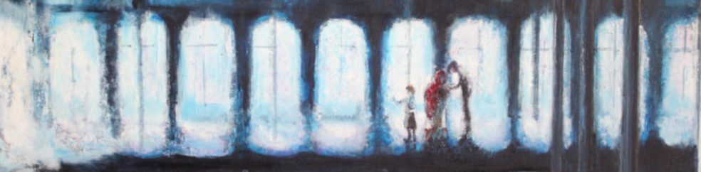
patches of brown form a wall directly in front and two perspectively angled at the sides, in the upper third of the image. The roof above these walls and the floor in the lower half appear to be drawn in a grey ground, the floor then being overdrawn with white patches in various directions. On this background are lines of white, patches of blue and small areas of red and orange. These coloured marks appear to represent kiosks,billboards, people and a possible escalator. The brown walls are broken by scratchy white patches in the shape of church windows. The grey ceiling is overdrawn with black lines to represent pillars and help with the perspective of the image. The marks are agitated and scratchy on the base of irregular patches, such that the image feels busy reflecting the activity of the station.
Matthew Draper
Fleeting,Black Cuilin ref:http://www.thepastelsociety.org.uk/index.php?option=com_content&id=111&Itemid=30
The pastel are laid in large suaves and blended softly into each other to give very soft outlines.
John Ivor Stewart
Stargazer and Lisianthus ref:http://www.thepastelsociety.org.uk/index.php?option=com_content&id=110&Itemid=30
Producing coarse textured effects
notes from “The artist’s handbook” ref: Meyer R The artist’s handbook of materials and techniques Fifth edition 1991 Faber and Faber ISBN 978-0-571-14331-3)
Huge blobs of oil paint, stirring in large or coarse grained particles…which includes sawdust, coffee grounds, tobacco.
Sprinkling ground glass, silica pumice or other dry powders onto wet paint
glue and tissue paper
Aluminium foil
Lifting–paper or textile painted over and then removed
Egg tempera tempera colours mixed with oil???
House paint. enamel paints
impasto medium –home-made
dribbling, blowing, splashing, squirting, spraying, wrinkling
hot wax resist and encasutic painting–hot wax mixed with the oil paint and spread with knife brush or hot tool..gives picture a sculpted effect.
mix oil and water paints and metal paints
crackle : gloss, wood glue, gloss
Use of a gloss under-surface
