look at paintings, oil sketches and watercolour.
how has the genre been interpreted?
how does modern landscape painting reflect environmental concerns?
Surely some of the earliest landscape painting done entirely to depict the landscape must belong to the Oriental artists:

“Maple Viewing at Takao (mid-16th century) by Kanō Hideyori is one of the earliest Japanese paintings to feature the lives of the common people.[2]”
quote and image sourced on line from: http://en.wikipedia.org/wiki/Ukiyo-e
This is a beautiful uncrowded landscape with the small figures going about their daily lives, diminutive against the background of their environment. The image is divided into groups of small pictures in which perspective by means of size tells us where each sits in relation to each other. At the bottom of the image are the rocks over which we seem to peep at the people. In the middle men and women sit or stand in activity around the central blue of the river. They are enclosed by an arch of blossom trees across the middle of the picture and above these fly birds. Above these in the distance are buildings on the right and snow-covered hills on the left. The image is warm and peaceful.
At a similar time in Europe Breughel was painting scenes of ordinary people within their natural environments:

Hunters in the Snow by Peter Breughel the elder source on line (October 2014 from:http://en.wikipedia.org/wiki/Pieter_Bruegel_the_Elder#mediaviewer/File:Pieter_Bruegel_the_Elder_-_Hunters_in_the_Snow_%28Winter%29_-_Google_Art_Project.jpg ) 1565
Here Breughel employs both linear and aerial perspective in his image of huntsmen and their dogs passing the firemakers and descending though the trees towards the frozen river on which small figures skate.The river valley stretches out from the right middle part of the picture where the eye falls on the small skaters, out to the horizon behind the trees and the hunters. There is little warm colour except in the dogs and the house and flames of the fire on the left. The snow and sky are white, grey and green-blue grey, against the dark almost black tall trees on which sit hungry crows, one of which flies into the centre top of the picture, lifting the attention to the distant hills.
I have chosen both these paintings because they fascinate me, the small people, living out their lives amidst the backdrop of their world hundreds of years ago.
Looking at the 18th century
Poussin 17th century
Landscape with travellers resting 1638-1639 by Nicolas Poussin
ref:http://www.nationalgallery.org.uk/paintings/nicolas-poussin-landscape-with-travellers-resting
The dark foreground is broken by a centrally placed figure in light clothes, the road passes behind him from lower right corner to an intersection between the horizontal and vertical golden sections on the left, as it twists into the distance. Figures sit at the river’s bend in the shade on the right and at the mentioned golden sections as it disappears behind the tall rocks on the left. The eye follows these figures and the road to the light of the distant sky and clouds reflecting in the lake behind the figure at the left golden section. The river and road are enclosed in a valley with cream rocks rising up to be decked by dark trees In the distance behind the lake are the blue grey hills catching the light. The picture according to the information on the National Gallery website was painted as a commission, had no mythological or religious significance but reflected the countryside around Rome. Poussin, however used landscapes to produce a Romantic ancient history or mythology. The dark and light tonal contrasts are unreal, the people isolated and distant (but not in the manner achieved by Hopper) and without colour. The image is softly painted.
I do not like this painting as it seems to be a practice in the art of perfection, he seems to have lost the guttural feel of humanity in its suffering and crude enjoyment which I see in the Breughel image. Perhaps Poussin’s landscapes appealed to the sophisticated, those who felt human emotion was below them, appealing to their higher senses or perhaps never having thought about the depiction of true nature.
Turner and the elements
It was the lash against this formal style of painting, the incorporation into art the true feel of nature that commenced with the artists of the early eighteenth century, perhaps lead by the developments in scientific knowledge and people like Turner paint what is actually seen and felt as in the Snow Storm off a Harbour’s mouth, for which the painter was said to heve felt the fury of the wind as he was lashed to the mast of a ship.
http://www.tate.org.uk/art/artworks/turner-snow-storm-steam-boat-off-a-harbours-mouth-n00530
Romanticism
From the end of the seventeenth century the Western world was changed dramatically as industrialisation swept away the country life and countryside. The painting revolution that occurred as a back-lash was called Romanticism and used landscape painting as a reminder of what was being lost.
Caspar David Friedrich 1774-1840 both images source on line (October 2014) from http://www.caspardavidfriedrich.org/home-2-24-1-0.html
Largeness by Caspar David Friedrich
Rocky Reef on the sea shore by Caspar David Friedrich
Neither of these images contain people and both give a feeling of cold isolation but majestic beauty. In the “Largeness” image pink and blue patches of water stretch out to touch a blue and yellow sky, the horizon broken by trees with little innate form. In the Rocky Reef, a dark foreground protects you from the sea and lilac rocks towering against the lilac sky and white horizon. These images are almost abstract and modern. They have for me much greater power than that of Poussin’s. Perhaps it is the contrasting tones, the openness of the image. There is no protection, in these images from the wilds of nature. Poussin’s landscape is amenable and calm (apart from the risk of bandits behind the rocks! )Caspar’s landscape is raw and cold.
Constable 1776-1837 living at a similar time to Caspar David Friedrich, an English Romantic painter who relished in the painting of the English landscape:
Dedham Vale 1802 John Constable
sourced on line (OCtober 2014 ) from:http://www.john-constable.org/Dedham-Vale-1802.html
Why is this image more pleasing to me than the Poussin? How do they differ?
I much prefer the colours of the Poussin but his colours are used in a less dramatically textured manner,the smooth rocks and path in the Poussin are replaced by scattered images of grass. leaves. roots,bushes and tree trunks in the Constable..the image is much busier. The story is much the same, a path leads from the lower right of the picture to the mid left where it meets water in which the sky reflects. A traveller sits by the side of the road in Constable’s painting but is a much more rural character with red jacket. Poussin’s image takes us via more cream, green rocks in the centre of the image to a tall tree and then to blue distant hills, the glowing yet solid (in comparison to Constable) clouds and the bright blue flat sky. Constable places buildings at the centre of the picture, these lead to a church in the distance (at the same place where Poussin puts the tree) and then to a much flatter landscape topped by racing clouds which darken and grow from the left. Both images have tall dark sides at the front where the path starts in the image but Constable’s to the upper right . The lower front of Constable’s painting is busy and full of interest by virtue of the detail of leaves and trees. His mid distance river is also much fussier and his clouds are full of change and activity.
Constable seems to have painted in small frequent pieces of colour as opposed to Poussin whose mode of painting seems to be much flatter and consistent.. the overall differences reflect the difference once again from a smooth, sophisticated perhaps intellectual image to a wild, feeling and guttural image.
Constable felt it important to capture the outdoors in all its wildness, colours and light effects and so sketched in pencil, watercolour and oil whilst walking the lanes of Suffolk. He used different techniques to add texture and interest to his images, including impasto, dots of colour through which lower layers shone and visible brush strokes. Rapid sketches outdoors were translated in the studio but he chose to retain the heart-felt marks with which he made the sketches.

 Oil sketches by Constable (sourced on line (October 2014) from http://www.vam.ac.uk/content/articles/c/constables-oil-sketches/)
Camille Corot
Landscape at Civita Castellana
Camille Corot
(French, Paris 1796–1875 Paris )
“Its rapidity of execution testifies to the artist’s aim of capturing his first impression of this panoramic view.”
Picture and phrase sourced on line (October 2014) from http://www.metmuseum.org/collection/the-collection-online/search/439407
this oil sketch as stated above was a manner in which Corot captured the colour and light of the valley, stretching into the distance and to cloudy sky. It was painted North of Rome, so interestingly, is an area close to that painted by Poussin and the colours are similar. In the sketch there appear to be several layers of colour, a pink brown under painting which shows through the light green of grass and darker rough patches of trees or bushes in the foreground and shines through the midground browns and blue greys to represent light on the low hills.In the sky the pink tints the clouds with the glow of evening or early morning.
Civita Castellana Corot 1826
sourced on line (October 2014 from :http://www.wikiart.org/en/camille-corot/civita-castellana-1827) file source:http://en.wikipedia.org/wiki/Jean-Baptiste-Camille_Corot
This is a more finished painting in the same area by Corot and reflects similar rocks and colours to those in the Poussin, however the colours are less “carefully applied” and much brighter.
The 19th century
The Impressionists at the end of the 19th century brought outdoor (en plein air) painting into vogue. The aim was to paint the quickly whilst looking directly at the landscape before them, capturing fleeting light and colours
Berthe Morisot 1841-1895
Landscape in Tours by Berthe Morisot ref: http://fineartamerica.com/featured/landscape-in-tours-berthe-morisot.html
is painted with visible brush strokes of thick paint, quick impressions of people,blurps and blobs of bushes and squiggles of trees…all captured in light colours. The picture is of a green patch of grass possibly a park in which stands a statue on the right. The green has an arching path around off to the left of the picture and on this path are the people depicted by single strokes of a paint laden brush. In the mid to upper background are the coloured trees of autumn and beyond(above) a pink and blue autumnal sky. This image could be compared in content to the Japanese picture with which I started , both about people relaxing in a man-made rural environment and both producing impressions of life. One works by small snatches of images of the world around the other by blurred images of the surroundings.
Edvard Munch 1863-1944
Munch was a Norwegian expressionist who gave vent to his emotions through his paintings.
The image in MoonLight painted in 1895
ref:ttps://www.google.co.uk/search?q=munch+moonlight+landscape+painting&client=firefox-a&hs=1xK&rls=org.mozilla:en-GB:official&channel=sb&tbm=isch&tbo=u&source=univ&sa=X&ei=atZHVMWAA8mX7Qa-t4CIBw&ved=0CCIQsAQ&biw=1366&bih=635#facrc=_&imgdii=_&imgrc=OrqUbYGQx-jprM%253A%3Bk5xHVed_fndMwM%3Bhttp%253A%252F%252Fuploads7.wikiart.org%252Fimages%252Fedvard-munch%252Fmoon-light-1895.jpg%3Bhttp%253A%252F%252Fwww.wikiart.org%252Fen%252Fedvard-munch%252Fmoon-light-1895%3B800%3B668
is the simple painting of a yellow moon on water seen across sand and grass in the foreground and framed by tall trees. The colours are tonally stark and contrasting, the lines of the image curve anxiously across the picture. The grass is painted in vertical large brush dabs, the trees are tall, thin and black reaching out of the image, the leaves and patches of sand where water meets sand are painted as solid but irregular patches of dark colour and the reflection of the moon in the water is not split by the ripples of teh water but is a solid stick of colour. The overall impression is threatening and sickly.He is using the landscape to reflect an internal mood.
Gustave Klimt 1862-1918
In my recent passion for Klimt…looking at his landscapes (which were painted at similar time to those of Munch) he uses the paint and techniques probably inspired by pointillism, that are seen in his paintings of women. There is a lot of fuss… colour in a spots and pattern which pick out the tones and turn the landscape into a patterned image rather than a reproduction.
see : flower field in Litzlberg ref:http://www.klimt.com/en/gallery/landscapes/klimt-blumenwiese-in-litzlberg-1905.ihtml
The image is a mass of differing greens with only the spots of red poppy heads leading into the picture to the darker green hills. There is a hint of a blue pink sky but otherwise the image is a confusion around the colour green.
The 20th century
Kirchner 1880-1938
Sertigtal in Herbst ref: http://commons.wikimedia.org/wiki/File:Ernst_Ludwig_Kirchner_Sertigtal_im_Herbst.jpg
This is a colourful image of figures on a balcony looking out over a river beyond which are mountains. The figures are painted in a primitive fashion and the use of colour without any evidence of aerial perspective , the use of distance without linear perspective also harks to a primitive or folk art manner of painting in which colour and form are of prime importance….almost the opposite of the school of Poussin, but denying knowledge in a way in which the Japanese painting does not even though perspective is produced in both the images
Klee 1879-1940
At a similar time Klee o investigating primitivism produces landscapes: Landscape with sunset ref:http://www.wikiart.org/en/paul-klee/landscape-with-sunset-1923 in which houses, trees and surroundings are reduced to blocks of colour which can be identified as parts of a landscape only by the presence of such markers as typical door and windows in a square with a pointed top.
Georgia O Keefe 1887-1986
Lake George 1922 http://www.okeeffemuseum.org/past-exhibitions.html
Similarly to the image by Klee, O Keefe uses colour and form to produce an image, which we translate as hills reflected in the lake and separated by a layer of mist. The painting is very minimalist in content and in colours and it is only our psyche which translates it into the image of a lake. T he psychological lessons that were being taught by Freud (1856-1939) at this time in the 20th century were influencing the manner in which form was expressed and using the mind of the observer to finish the story.
Cy Twomby
having been introduced to this artiost in an exhibition in which he Turner and Monet were compared. Their guttural response to landscape. Twombly employs only the minimum of mark and colour to produce a feel of the landscape.
http://www.wikiart.org/en/cy-twombly/landscape In this landscape the black and yellow upright marks feel like wave bashed struts of the pier and also have an impression of the ink paintings of Japan in which a few strokes of the brush produce the image.
 Japanese ink wash landscape sourced on line from: http://en.wikipedia.org/wiki/Ink_wash_painting
The background to these black struts there are horizontal thick deposits of a cream and olive yellow, perhaps the sea seen through the pier’s supports? The overall feeling is of a cold and friendless image produced by the contrasting tones and lack of warm colour.
The cityscape
As towns have increased in size, artists have looked to the towns and cities for inspiration and painted not only the picturesque but also the mundane.
George Shaw
The passion Number 57 ref:http://www.bbc.co.uk/arts/yourpaintings/paintings/the-passion-number-57
Here the landscape are the houses across the road. Without any emotion or figure representation the houses stand in the line in which they were built, pink walled council houses with matching doors and windows, some with the reflecting light; doors of differing colours , patches of bright green front lawn , red blocks of chimneys standing on the grey roofs against the monochromatic blue sky.It could be a painting of stone age huts in a village from before time and has a feeling of desperation about it. Is something going on in one of these houses –are they growing marijuana in the attics?
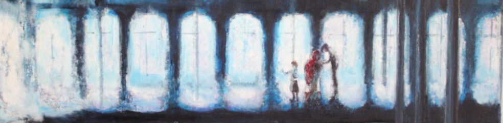
Joash Woodrow
The image depicted in the OCA folder is by the artist Joash Woodrow
Further paintings of his are abstracted images of the environment of Leeds. Using very heavy impasto paint he splats out the pictures using a lot of white,pale greys and blues and hints of yellows and russets. The buildings,white fences and tall trees become an abstraction of forms, distorted in perspective and in thick overlaid colours.
ref: http://108fineart.com/joash-woodrow/joash-woodrow-late-works-1976-onwards/
Karin Andersson
A Swedish artist depicted in the book “Vitamin P2 New Perspectives in Painting” Grey colours,textured application of paint as though mixed with water or an oil repellent, people working in the fields in a medieval fashion in a harsh landscape in which it is difficult to differentiate stone from building.. The book tells us she uses her images as a lead to narrative, to be completed by the viewer.The image below is cold and impersonal (she has been compared to Hopper-) has little feel of happiness or togetherness….the people are as distant as those in the Poussin picture above and far less warm or content than those in the Japanese painting above.
 Looters by Karin Mamma Andersson scanned from the book “Vitamin P2 New Perspectives in Painting Phaidon press London 2013 ISBN :978 0 7148 6160 9)
Artists and modern environmental concerns
Kurt Jackson
Kurt has been artist in residence on the Greenpeace ship whose art work reflects a concern with environmental issues.
He has painted a colourful series of the river Thames which contrast the dark grey mixture of the city (“on top of the Shard”) with the subtle peaceful colours of its course through the countryside. Without becoming Romantic in his representation of the river there is a subtle difference in the two parts of the Thames. ref: http://www.redfern-gallery.com/kurt-jackson_1035
Mauro Bodin
An Italian born artist working in Paris concentrates on painting the images of man’s impact on the earth and his responsibilities towards the planet on which he lives. In colour, texture and impressionistic images he paints human and natural landscapes destroyed by the hand of man.
Hiroshima 1945
http://www.saatchiart.com/art/-499-Hiroshima-1945/30476/114721/view
