Optical effects have been exploited by many artists to create movement and depict the effects of light. The Impressionists, post Impressionists and Neo-Impressionists-in particular the pointillists Signac and Seurat made full use of the new understanding of the nature of human perception.
Find out what you can about these artists’ aims and study their pictures to see how they achieved effects such as optical mixing. Look also at the work of Bridget Riley or the Op artists.
Vision involves the translating of light, with its wide spectrum of wavelengths, geometric forms and movement. The light stimulates the rods(sees white light) and the cones of the retina(see coloured light) to produce nervous impulses which translate into images in the brain’s occipital cortex. The resulting image fits into the brain’s previous perceptions and results in our response. Perception, learning and as yet unknown actions of the brain are as important as the light rays entering the eye, in producing the colour that we finally see,
In recent years Land has demonstrated that the plasticity of the eye and brain actually change colours :Land theorized that even if lighting conditions change, the retina and cortex will cooperate to ensure that the image of a specific object will not become unrecognizable, and will maintain a similar color .
It was Newton’s study of white light which first described it’s structure as consisting of the spectral wavelength of colours , Young (1803 )who postulated how the eye sees the variety of colours. and Hemholtz who described how wavelengths of light stimulate the retina.(circa 1850s).
There are three main colours in light which cannot be made from any of the others: these are red, green and violet. These three colours are primary because the human retina has only three kinds of colour receptive cells : S (respond to the short wave length light of blue, M which responds to the medium wave lengths of green to yellow and L (long wave )responding to red light. The light waves release chemicals which stimulate nerve impulses to the brain where once again there are areas specific to the three primary colours. The secondary and tertiary colours arise from mixed sensations from the three primary receptors. (Some animals have four receptors, with one responding to the ultraviolet very short wave lengths).
Reflected light has three different primary colours because of the pigments involved in making the reflecting surface (e.g. paint) ( these are yellow, blue and red).
In the mid nineteenth century(1839), Chevreul, a chemist and director of a textile dyeing firm investigated the production of dyes from vegetable matter and the interaction of colours in fabrics and realised that different colours laid closely together had an effect on the overall collective image. His papers and lectures on the law of simultaneous contrasts, in which a colour induces its opposite in the colour wheel on its surroundings and will leave its opposite as a ghost image when viewed in bright light and then removed, lead others to study the effects of colour as a subject in itself. Until this, colour was part of the overall picture, now, it took centre stage and has continued to do so in the medium of photography.
In the 19th century ,with the rise of scientific investigations several artists were coming to the fore and were stimulated by the importance of light and colour:
Ruskni summed up some of the theories of the era by describing how colours are but flat patches, a medley which is built by experience into form and echoed Chevreul’s theories by emphasising how colours affect each other , how white and black affect colours.
Impressionists: Manet b 1832 (1863 “Dejeumer sur l’herbe”), Monet b1840 (1872 “An Impression sunrise”), Pissaro b 1830, Degas b1834 band Renoir b1841 . Sisley b 1839 and Berthe Morisot b 1841 al; included in the 1874 Impressionist exhibition
Hence, the Impressionists were born into a world of developing technology, insight into the structure and interaction of light and the appearance of the photograph and the development of new colours in oils in easily transported tubes. Fifty years earlier the artist Turner b1775 had used paint to express drama through light effects. The Impressionists painted quickly, leaving brush strokes visible often outdoors to capture the changing light and colours. They laid pure colours together on the canvas rather than mixing them on the palette so letting the viewer’s eye and brain mix them together and give a fresher brighter impression in which patches of broken harmonising or discordant colours played in a symphony.
 Claude Monet Garden Path at Giverny sourced on line (August 2014 from claude-monet.com
Post Impressionists: (1880s) Gauguin b 1848 , Cezanne b 1839 , Van Gogh b 1853
Van Gogh left many letters to his brother Theo in which he discusses the use of colour as an effect and a reflection of his inner moods.He and Gauguin based their use of colours on the mode of painting in Japan , pure, flat and either used as complementaries to produce dissonance or as harmonies to produce calm. Van Gogh speaks of the colours in his Bedroom at Arles paintings as including violets,yellow,orange, scarlet.lilac -most of them secondary colours which he felt induced a state of rest.
Neo-Impressionists: Seurat b 1859 and Signac b 1863 pointillism circa 1884 followed the teachings of colour theory researched by Chevreul in 1839. Starting as Impressionists these artists looked further at the scientific basis of colour theory and the law of simultaneous contrasts, as proposed by Chevreul and their use of unmixed dots of colour on the canvas were a reflection of this theory. That colours affect each other and change each others appearance , that colour boundaries may have halos of complementary hues were used by the artist.
The Pine Tree at St Tropez by Paul Signac
This is painted in small brush strokes of juxtaposed colours ranging from a lime green through blues and violets to oranges and pinks. The tree’s orange, pink and pale yellow trunk is surrounded by the blue and purple hedge, complementaries being used to accentuate and bring forward the trunk against the hedge.
I find the colours too acid and I am not convinced that the small dots of colour produce a mix –they remain dots so placed as a to represent a tree!
George Seurat Sunday Afternoon on the Island of the grand jette
Seurats dots of colour are much smaller and closer together and so give a greater impression of unity, but I am still aware that the image is made of dots so much so that its appearance is grainy. The colours are much more to my liking, less acid. He has contrasted a foreground of lilacs, dark green-blue and blacks against a bright background of lemon green yellow and orange browns.
The brightness of a colour depends on ambient light and how many of the functional rods and cones are picking up the colour and so “firing” but it is affected by surrounding colours and their intensity. There is a halo effect of the complementary colour around the border of a colour. It is also known that colours in the middle of the spectrum (yellow/green s) look brighter than those at either end (reds or blues)The brain is thought to concentrate on borders in an image where light meets darks or one colour another,(ref: book : R.L. Gregory The eye and the brain. (2005) Oxford University Press ISBN-10:0-19-852423-4 ) and change the colour to a complementary beyond a boundary (a halo effect) in order to make that boundary more visible. The brain is less interested in large flat areas but more so in these boundaries that it works on to accentuate so form can be more easily read.
It is also known that an area appears brighter if surrounded by dark and lighter if set against dark.
Ruskin described the changes in colours when put in relation to black or white, how the very same colour can appear much lighter if accompanied by white than by black, he voiced the theory of the innocent eye (1856)….”every hue …is altered by every touch that you add in other places…so that what was warm a minute ago becomes cold when you have put a hotter colour in another place, and what was harmony when you left it,becomes discordant as you set other colours beside it” (ref book E.H. Gombrich Art and Illusion A study in the psychology of pictorial representation.(1995) London Phaidon press ISBN 0 7148 1756 2 )
Van Gogh was very fond of yellow and of the bright yellows and oranges of the South of France, (where it is said the light is the best in Europe.)
Sunflowers by Vincent Can Gogh
This painting is almost entirely yellow the bright flowers appearing dark against the even lighter yellow background.
and Gauguin contrasts dark against light and yellow for visual impact:
Still Life with Japenese print Gauguin
Motion
It is also known that certain patterns can instill the impression of motion and that colour and form and motion are linked in the brain. In 1935 Wallach demonstrated the link between colours and the perception of motion. Hoffman, in the last twenty years has investigated what he called dynamic colour spreading , explaining which areas of the visual system were responsible for the conscious perception of colour and which for motion and how the two (as demonstrated by Benham in 1895 ) are linked. He has employed diverse experiments which investigate how the eye and brain can be deceived when colour, tone and motion meet but the mechanisms by which our eyes and brain deceive our consciousness are as yet unknown. It is however clear that the brain adds to information in order to make its sensory stimuli fit with the world that it knows. If it looks to it as though something should be moving (as that is how movement would look), we will see it move, even if our intelligence tells us that it is just a collection of static shapes.
In the mid 1960s Bridget Riley and Victor Vasarely exhibited visually stimulating geometric pictures inducing a visual sense of movement at the Museum of Modern Art in New York. It was named optical (or Op art)
Bridget Riley used geometric black and white or colour images to produce a sense of movement with the intention of using that sense in a psychological manner.
She started with the production of movement with black and white imagery:
Her 1963 work “The Fall” is a vertical image of waving black and white lines which appear to vary in thickness and to approximate to each other across sections of the painting, the waves become shorter from top to bottom and they produce an overall impression of movement, of a swaying sensation that almost leads to dizziness and as Riley states in her explanation of the image “in a visual energy …that reaches a maximum tension”
Bridget Riley The Fall 1963
Other black and white works of a similar era are:
Hesitate
Here the simple shape is the black spot which by changing its shape to a small ellipse, appears to also change perspective giving a feeling that a piece of spotted paper has a fold in it –this is accentuated by the presence of what appears to be light falling across the paper as the spots change to a lighter shade, again she is using this imagery to invoke emotional feelings of tension and relief as the round spots crowd closer and flatten into ellipses (at the fold) and then pass over the fold to reform into rounded shapes.
Blaze
This is a circle divided by a line which runs like the shell of a snail from the circle’s periphery to its centre. From the edges of this line are black projections which run out in an angled fashion to produce a feeling of spinning and being dragged like the water swirling down the tap, into the centre of the circle. It is difficult to fix the eye on one place as it is dragged around by the image and force into the hole which is off centre from the middle.
These images are similar to that of the Fraser spiral illusion (1908) in which concentric circles appear to be spirals because of the lines of different shades which sweep into the centre of the image
Coloured pictures “
“She has ” taken imagery primarily orientated to the colour spectrum to a spatial plastic approach to colour” Ref: book: U. Grosenick Women artists in the 20th and 21st century (2003) Taschen )”
Nataraja 1993
Vertical lines divided by unequally spaced diagonal lines divide the canvas into blocks of multiple colours with what appears to be a preponderance of blue and violet.
“The complexity of the colour relationships is formidable. Many of the colours exist in as many as twenty different shades. The position of each of these elements has been carefully judged in terms of correspondence, contrast and proportion………“Riley’s use of the term Nataraja (Indian God of dance)…… refers to the emphasis on rhythm and counter-rhythm, which are central elements in the painting.
Victor Vasarely
Vega 1957 by Victor Vasasrely
A board of black and white checks with distorted areas that look as though a convex or concave lens has been overlaid which seems to move and pulsate.
Vega Nor 1969 by Victor Vasarely
Here a board of muted coloured lines appears distorted by a round object pushing from behind and increasing the intensity of the colours such that yellow becomes dominant in the foreground. As it says on the op art web site ” it gives the feeling of something trying to recede or push out from the surface. The image consists of line either curved or straight but the eye and brain give it the meaning of a round object pushing through a grid.

 “One with Nature”


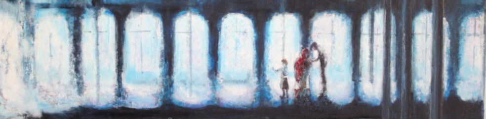
 Black Knot by Georges Seurat sourced on line Sept 2014 from: http://www.georgesseurat.org/
 sourced on line from:
") seated woman with a parasol (Sourced on Line Sept. 2014 from:
seated woman with a parasol (Sourced on Line Sept. 2014 from:
 sourced on line (September 2014 from:
 sourced on line (Sept. 2104 from:
