Definition of an expressive landscape according to the OCA handbook: psychological,emotional or symbolic interpretations of the landscape.
Surrealists and Expressive Landscapes
Starting in the 1910s and 1920s and related to the developing study (by Freud) of psychology and the subconscious mind, surrealism sought to paint the landscapes of dreams or nightmares. The surrealist’s and later the Dadaist’s art was released from reality and free thought giving reign to fantasia and to a backlash against tradition.
The surrealists included Max Ernst, Andre Masson, Joan Miro,Man Ray, Renee Magritte. Surrealism began with automatism, art which formed by itself from unconscious thoughts and feelings to the art of Salvador Dali whose Surrealism involved illusions and dream like images. In Dali’s camp of surrealism was found, Paul Delvaux and Andre Tanguy ref: http://www.metmuseum.org/toah/hd/surr/hd_surr.htm
Salvador Dali (1904-1989) and expressive landscapes
The persistence of memory ref: http://www.moma.org/learn/moma_learning/1168-2
In the background golden rock formations rise from a blue sea backed by a golden and purple sky (based on the beach at Catalonia and the only part of the image which are realistic). On the long foreground brown beach are images which represent time’s passing and decay. Two rectangular platforms are seen in the image, like stages or table tops the closer one has a dead tree rising from its surface, a molten clock falling over its brim and a closed pocket watch sitting on its surface which is covered in ants which represent decay. The tree has a molten clock hanging from its branches. On the beach’s rocks is draped a skin coloured form which appears molten in one half but has the more solid appearance of a face at one end. This face initially looks like that of a bird but on closer inspection has the closed eye, nose moustache and protruding tongue of a human being. Overlying this form is another molten clock. The clocks were apparently based on molten cheese. The overall image is disturbing, particularly the form lying over the rocks which brings the thought of death into the image and contrasts against the long-lasting beauty of the glowing cliffs and horizon. The clocks challenge the usual view of the solidity of time a metaphor for how time melts away. Dali has not so much used a landscape to express but added very contrasting forms to a landscape to produce a jarring and uneasy feeling …beauty entangled with horror.
The shades of night descending
image scanned from the book: Descharnes R.,(1987) Dali, Concise edition. London: Thames and Hudson. ISBN 0-500-08019-4
 Once again a flat area of sand is pierced by tall rocks and cliffs. The background is the brilliant turquoise sky broken by an area of cool cloud, becoming a golden green yellow at the horizon. The light catches two areas of cliff at either side of the horizon whose colours consist of pinks, purples, pale blues and gold. In the middle ground on the left stands another fortress like rock whose walls are blue and grey but whose tip, catching the setting sun is brilliant orange. In the centre midground a low rock protrudes from the sand without any impression or wrinkling of the flat brown, orange gold surface and stands in an irregular shape in a glowing shades of orange. The foreground is dark, in the shadow of what would be assumed to be another rock formation.This deep red-brown shadow encroaches onto the sand in an unusual shape with a very rounded and soft outline. At the peak of this shadow in lower mid picture is a white object, light catching it from the left. It looks like a skull but casts a tall and distinct shadow which is different in character by its intensity and sharpness, to the other shadows from the rocks. The right foreground is broken by a deep brown rock face, to the left of which stands an object made of swirling lines of pale blue, white, yellows and pinks. It too is partially shaded such that only small areas catch light of similar intensity to that of the sky. The book describes the foreground shadow as being much more intense in tone than other shadows in the image and brings the attention to the fact that the shadows produce a form of paranoia by their irregularity of shape. The foreground shadow is of a grand piano! The blue swirling form in the right lower part of the image is said to be spectral in nature due to its apparent floating fabrics,but hides various objects which produce distortions in the overlying fabric. On its back is a glass and a shoe. The shoe is said to have been a fetish of Dali’s.
There is little texture in Dali’s image, particularly in the wide expanse of sand and this expanse produces a feeling of desert and emptiness. The dark shadow occupying most of the lower half of the image feels threatening as does the blue figure in swirling fabric lines at the right corner.
I neither like the feel of the image, nor its possible meanings, but it is revealing to read how these feelings have been produced with the use of composition colour and confusion.
Max Ernst 1881-1976 a member of the Surrealist and Dada movement
The entire city ref: http://www.tate.org.uk/art/artworks/ernst-the-entire-city-n05289
Max Ernst was born in Germany in 1891.
This image was painted in 1934, after the first world war when Germany was experiencing the rise of Nazism.
The whole image, to me appears to have been put together with pieces of metal from an old machine, even the white moon looks like a cog or flat piece of metal. By producing a town from a collection of browns greys blacks and pinks which line up as though bicycle chains laid next to each other, the image is without humanity. The image has a feel of fortification in which some of the darker patterns resemble a castle battlements. So an aggressive feeling town built of manmade soul-less objects which may reflect not only the march of industrialisation, but also the building tensions before the war, as Nazism invaded his country. The image was produced by grattage in which the paper was placed over a textured object and paint was then scraped across its surface producing an image by chance.
It is unattractive, cold, foreboding and once one realises it was probably produced by chance,by grattage has no appeal whatsoever!
The whole city ref:http://www.abcgallery.com/E/ernst/ernst26.html
A deep blue sky fading to green on the horizon. A bright yellow globe which could be sun or moon, in the centre of the sky. The a rock formation sitting on the top of a series of steps in a patterned russet colour with the reflecting yellow sun catching their surfaces. Set at angles to each other, these steps lead forward to what seems to be an area of scrub ground with broken stems of plants, pieces of wood and flowers whose pale colours make one think they are dried. The rock on the top of the steps looks like a statue of a lion and the whole image because of its colour and flatness feels like the relics of an Egyptian or Aztec temple, appearing to rise from the overgrown foreground quite steeply to the sky. There is no humanity, again there is little soul perhaps due to the straight lines, but even the flowers appear without life. The colours clash, the images clash (plants against the rigid lines and the stark globe of the sun,)there is no attempt at harmony either in form or colour and hence the landscape is cold and threatening and with an imperial distance.
Georgio de Chirico 1888-1978
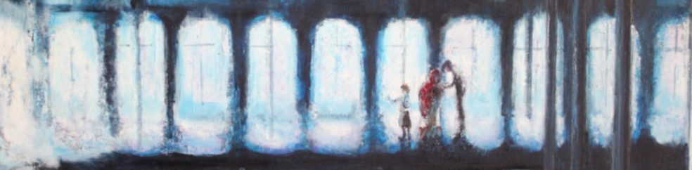
The anxious journey 1913 ref:http://www.moma.org/collection/browse_results.php?criteria=O%3AAD%3AE%3A1106&page_number=4&template_id=1&sort_order=1
This image is a play on perspective with multiple tall arches producing narrow doorways in multiple confusing directions and on several levels.The colonades are painted in dark greys and blacks and hence are exceptionally sombre and impersonal. Only one doorway leads to a view in the distance of a dark smoking stack , perhaps a factory, perhaps a train seen beyond a featureless area of sand over which falls a dark geometric shadow and a small red brick wall. The anxiety of the title is reflected in the confusing doorways as well as the threatening smoking stack which is visible through the only doorway allowing you to leave the maze.
Chirico’s use of confusing perspective was one of the starting points from surrealism, the word meaning beyond the real, in the dream world of the fantastic, in which objects and events are put together in illogical fashions.
The enigma of Day ref:http://www.moma.org/collection/object.php?object_id=80587
A large white statue stands in the foreground, is he a dictator who has taken happiness out of people’s lives. Behind the featureless ochre floor which at the bottom of the canvas is overcast by a dark shadow slanting across the front of the image. On the left of the image at the back at the statue is a row of arches similar to the Roman arched railway bridges. This runs into the middle of the picture with an exaggerated perspective which gives it length and drama. Its stark white almost shining surface contrasts against its dark spaces. On the horizon are two red chimneys which frame the statue and loom from the russet horizon . In the distance in front of the chimney on the left are two lines which could be human figures, made tiny in the landscape. On the right of the picture we catch the edge of another structure whose perspective leads into the picture but not in a consistent manner to that on the left. In the middle right of the picture is what appears to be a wooden box with black lid. We have been subject to many such images since this was produced that it is difficult to translate the meaning or feeling without recourse to our subconscious knowledge which may be very different to that of De Chirico. But to me it speaks of 1984, George Orwell, loss of life in the form of trees, plants, people;control by military and factory production lines and insignificance of the human being. Feelings produced by the irregular perspective (anxiety and mistrust), by the cold statue (denial of human emotions), the tall chimneys and long perspective featureless building (overtaken by inhuman industries, humans being turned into automatons).
Emotional landscapes of Paul Nash
Paul Nash English artists 1889-1946
I am initially amazed that Paul Nash was a contemporary of the surrealists mentioned above, I always believed he was much more recent,perhaps because many of images depict the hopeless and depressed feelings of the second world war.
Totes Meer (Dead sea) refhttp://www.tate.org.uk/art/artworks/nash-totes-meer-dead-sea-n05717 1940-1941
This image could be a sea scape, the rising waves crashing onto a beach in the left corner, until it is realised that the waves are made from aeroplane parts. Painted from a dump of broken German airplane parts and using a German title for dead sea, the landscape becomes a reminder of the men who have died as these wrecks were produced. Nash commented on how the wreckage looked like the sea but had no movement and was itself dead. The image uses only muted colours of greys and some ochre, the sky is a cold blue and the moon is white and grey. There is a hint of sienna ground on the horizon with a few grey trees. The overlapping lines and criss-cross airplane wings produce stasis to the rise and fall of the waves.
The Menin Road By Paul Nash 1919 First world war
ref:http://www.iwm.org.uk/collections/item/object/20087
A landscape of pink grey blocks of concrete, of faun brown hillocks and flashes of white water tinted with hints of pink and ochre, is set against a deep purple blue sky in which clouds billow on the right and the lines lights flash into the air and disappear behind the lines of deep purple clouds. The landscape is potted with trees which are dead and have neither foliage nor branches but stand stark and equally colourless against the background. Centrally two small figures fight their way through the desolation and destruction. It feels warming that these figures have each other amongst this alien landscape. Produced by cold colours, geometric and simple forms which reflect life in a desert and the random positioning of water and streams, coldly clashing against the background, this image expresses devastation and loss of life by plant and animal.
“We are making a New World” ref: http://www.tate.org.uk/whats-on/tate-liverpool/exhibition/paul-nash/paul-nash-modern-artist-ancient-landscape-room-guide-0 The use of tertiary colours without warmth or brightness, the loss of all life by stark remnants of trees and dry brown earth produce a cold feeling of desolation,but in the background behind the flat russet hills is the bright white light of the sun, which makes one think of the title leading the mind to a brighter future but also intensifies the contrasting tones which increase the emotional coldness of the picture.
Graham Sutherland (1903-1980)
Another artist of the war years whose painted desolate landscapes full of feelings of despair.
Red landscape
ref: http://www.bbc.co.uk/arts/yourpaintings/paintings/red-landscape-18099 1942
Here a pink grey and black hillock, textured with lines and splashes rises in the centre of the picture from a blood-red foreground and stands against a crimson red-brown/grey sky whose varying shades show through producing the impression of clouds. The hillock has large square blocks at its base which makes us think that this is the remnants of a house or building. The red gives an anger and feeling of blood to the image and contrasts starkly;y against the cold pink of the hillock taking away all warm feelings that may be provoked by this colour.
Devastation 1942 City Panorama of ruin
http://www.bbc.co.uk/arts/yourpaintings/paintings/devastation-1941-city-panorama-of-ruin-50548
Oblong, textured quadrilaterals from bottom to top of picture, painted in greys and grey greens with hints of deep pink and evidence of small windows, tell us these are the sky scrapers of the London skyline. Their dark blacks and greys contrast against the white light falling from the right, a ghostly unnatural light which makes the image cold and inhuman. Behind a muddy dark sky is contrasted and at the bottom of the canvas a few dark lines represent the smaller buildings. The sky scrapers look tall, but are only blocks of textured colour, the feeling is once again of coldness, inhumanity and loneliness and is produced by the mute colour and contrasting tone.
German Expressionists and landscapes
Emil Nolde 1867-1956 one of the first Expressionists and a member of the Die Brucke.
Uses intense colour and thick impasto.
Autumn Sea ref:http://www.wikiart.org/en/emil-nolde#supersized-featured-277876
Swirling yellows, browns, purples and whites produce an emotional sweep as they represent the colour and weather of the autumn sea. The colours jar and have a stressful feel similar to the jarring in perspective and colours already discussed.
A long time ref:http://germanexpressionism.net/german-expressionist-painters-emil-nolde/
 A fiery sky overpowers a colourful sea. The sea, painted in heavy brush strokes in primary blues, greens and yellows with some mixes with white. The sky,reds and yellows at the horizon move up into splashes of purple and peeking greens , deep orange and red colours blended with purples and splashed through with light blues and greens. The image has power because of the brush strokes but also because of the clashes of colour.
Vasily Kandinsky 1866-1944 Russian born
Landscape with factory Chimney 1910
ref:http://www.guggenheim.org/new-york/collections/collection-online/artwork/1853

This image uses techniques of cubism in which areas of form are painted in mixed patches of colour with visible overlying brush strokes. The image is divided by arcs delineated in black and possibly representing the rolling countryside. But within each arc are a glorious mixture of secondary and tertiary colours which have a greater harmony than the colours of Nolde’s images. Within the arching hills lie small impressions of houses, collection of houses, Church towers and windows (in red) and the purply red and orange chimney which rises from the lower third of the left hand side of the image and disappears off the top of the canvas. In the right foreground are two irregular deep grey structures with red (on one) and pale blue (on the other) spots which could be fruit trees. Kandinsky’s use of white mixed with the secondary colours produce less anger and jarring than that found in many expressionistic paintings. I don’t know what emotion Kandinsky was trying to produce, He began to construct paintings around particular experiences of colour or light. As he developed these elements, the physical presence of the landscape receded in favour of purely pictorial questions of colour and composition. the Tate writes:
” He began to construct paintings around particular experiences of colour or light. As he developed these elements, the physical presence of the landscape receded in favour of purely pictorial questions of colour and composition. ” ref:http://www.tate.org.uk/whats-on/tate-modern/exhibition/kandinsky-path-abstraction/kandinsky-path-abstraction-room-guide-0
Being credited with the first abstract paintings Kandinsky used the colours forms and feelings of his Native Russia incorporating his religious beliefs and folk art.
Artists of the Symbolist movement
What is symbolism? quote taken from: http://www.metmuseum.org/toah/hd/symb/hd_symb.htm
“Symbolist painters believed that art should reflect an emotion or idea rather than represent the natural world in the objective, quasi-scientific manner embodied by Realism and Impressionism. Returning to the personal expressivity advocated by the Romantics earlier in the nineteenth century, they felt that the symbolic value or meaning of a work of art stemmed from the recreation of emotional experiences in the viewer through color, line, and composition. In painting, Symbolism represents a synthesis of form and feeling, of reality and the artist’s inner subjectivity.”
Gustav Klimt
 The poppy field (1907) ref:http://www.klimtgallery.org/Poppy-Field.html
Klimt uses soft colours, probably mixed with complementaries and or white and their interaction in a pattern of small but evidently descriptive dots (unlike pointillism in which the dots are very small and used to produce interference and so colour) of flowers and leaves. In the poppy field, the poppies give a dense blush of red amongst the green ,blues, yellows and whites, in the lower left of the canvas, and then move in decreasing numbers and intensity, into the middle of the picture. They skirt around a tree, whose yellow-green and blue spots and dashes of leaves form a canopy in the upper third right. The tree trunks are broken be the spots of colour of flowers and trees. In the distance denser spotting and deeper blues make out the rounded forms of the tree canopies and a deep blue hedge encloses the field below a sliver of grey blue sky. The image is active and light-hearted and has none of the serious solidity of the images of Nolde. Klimt’ concentration in his paintings, on speckles of colour, or on colourful patterns often involving abstracted flowers,and his use of subtle warm colours produce in me a carefree feeling, however his depiction of people with their long distorted limbs and necks detracts from his images. Shape and use of broken areas of particular colours are being used to induce feelings. Looking through Klimt’s gallery (http://www.klimtgallery.org/home-6-24-1-0.html) I notice that Klimt rarely painted a distant view but concentrated on close images which could lend themselves to the breaking of form into small areas of colour.
Gustave Moreau 1826-1898 French symbolist painter who concentrated on mythological or biblical scenarios.
I can scarcely bring myself to look at Moreau’s art as it has such little appeal and even repels, is that what I am meant to feel by the manner in which he paints? These images could be in vogue today with the fantastic stories of strange beings and peoples that fill the cinemas and are produced by computer graphics.
Arion ref: http://www.wikiart.org/en/gustave-moreau/arion
According to wikepedia Arion was a character from ancient Greece , an exceptional lute player and inventor of music who won great riches at a music competition and was subsequently captured by pirates,thrown into the sea and rescued by dolphins who were sent by Apollo in response to Arion’s songs.
This highly dramatic image (hence my dislike, along with the drama in the present cinema) shows an anguished human being, who I thought was female but turns out to be male, a worried face turned towards the right and body in long flowing mute red gown turned to the left. There is a lot of brocading, or is it a sea monster ?crawling uo the front of his flowing gown and his hair flows out and down like a serpent. He holds a very ornate instrument on high which by reference to the information from wikipedia must be a lute, as though he fears it may be stolen or damaged. Behind the figure lies a barren landscape, the horizon just below mid canvas splits a flat land strewn with patches of ? debris painted in dark browns, muted golds and hints of deep reds; from an angry sky in which grey clouds billow on the left of the image whilst a glow of white light appears behind the figure and his prize. To the right of the image on the horizon is either the ruins of a building or a cliff formation in the shape of an arch. This structure is so placed as to appear to be at the base of the billowing cloud and so my first impression was that it was on fire.
The painting is hyperdramatic with facial expressions. flowing garments and hair, deep tonal contrasts, lack of colour and billowing clouds and barren landscapes……….Yuk.
Leon Bakst 1866-1924 Russian artist involved in the production of costumes for the Russian ballet
Although I love his flowing and patterned designs (which remind me, except in use of colour of Klimt’s) for costumes, his landscapes are much more austere and weird. and hyperdramatic, perhaps because of their use as stage scenery for ballet which is in itself hyperdramatic, not having the element of speech in order to tell its story.
Eilisium 1906 ref:http://www.wikiart.org/en/search/leon%20bakst/1#supersized-search-188124
This landscape could be in Middle Earth and a set for the recent Lord of the Rings movies. The tall dark trees in varying blue shades overpower the people and the ancient columns which nestle in the centre lower left of the image. A weird flying animal with human head appears from behind the trees, whilst children or lovers talk hand in hand on the foreground hillock. The dark of the trees and the winged creature are threatening, but in the lush green valley people seem unmoved…. there is a tension of expectancy…an anxiety again produced by the clash of light against dark tones, by enclosing the light within the dark and by the height implied in the trees contrasted against the snug size of buildings and people.
Frida Kahlo
Much of Frida Kahlo’s work reflects her obsession with the pain and disability which she acquired after a car accident
landscape 1946
http://www.fridakahlofans.com/c0530.html
This is based on the dull colours of ochre, pinks and greys which form a dry rugged landscape with no evidence of life. Deep black fissures run across the image and centrally is a rock formation in which the dark lines and curves make you think of a human body. In the left lower corner is a white face not even a skull. The landscape’s horizon is high and the sky beyond is tonally contrasting with a bright light area to the right and deep purples and greens to the left. “The landscape symbolises the artists broken body” It certainly feels distasteful and barren and the clog of brown and black in the centre feels like something to avoid.
Urban landscape 1925
http://www.fridakahlofans.com/c0008.html the description of this painting describes the urban landscape as cold and desolate because of the simple square structures and the lack of colour.
John Virtue
How can I avoid John Virtue, born in the same town as myself, Accrington, a few years before me, his mother taught my sister at school and his dark pictures of Lancashire have always reflected by feelings of this grim wet grey county with is barren moors
His painting of Accrington from the Coppice: ref:http://www.bbc.co.uk/arts/yourpaintings/paintings/accrington-from-the-coppice This painting has less atmosphere than most of his images but is a more descriptive image in black and white oil, of Accrington from the town’s hill the Coppice which overlooks the town. Atmosphere is produced by the use of black and white and the wild boiling of the sky.
Another image of one of the villages near Accrington with drama produced by the isolated little white houses which catch the white Lancashire white and the large dark sky. ref: http://www.bbc.co.uk/arts/yourpaintings/paintings/view-of-green-haworth-from-the-north
More atmospheric and characteristic of his dark and depressing images, of landscape obscured by what must be the weather, the rain and the dark looming clouds is the image: ref:http://www.bbc.co.uk/arts/yourpaintings/paintings/landscape-301-64263
Mood is a feeling often provoked by outside stimuli. We all know the feeling of being caught in a winter storm or of being snuggled by a fire, of walking through a summer meadow or looking across a beach as the sunsets……..
Negative moods include: anger,anxiety, apathy, depression, loneliness,coldness. These represent states that are threatening to the self and the negativity serves to aid action to remove them.
Positive moods include: happiness, calm, peaceful, liveliness, hope, warmth.
Looking at these selections of paintings there seem to be several ways in which the artist provokes mood.
The surrealists painted things which could not be real, often found in our nightmares when the brain connects things in an illogical and unusual manner…if this occurred in real life we would be frightened and confused.
Many of the artists use barren landscapes, with little form, texture or colour to provoke a feeling of emptiness.
Irregular forms which resemble things which we don’t like…ghosts, bodies, skulls are incorporated.
Unreal perspectives and shadows falling both irregularly and in illogical tones produce tension.
Reflection of threat using mounting dark clouds, evidence of mysterious winds or of cool pale featureless water.
Contrasting tones and colours can be used to produce anxiety.
Stark buildings in both colour and form are unfriendly whereas the multiple light colours of Klimt’s flowers are pleasing like the meadow in Spring. Buildings or plants/trees destroyed by war.
Enclosed spaces in which tall dark buildings or trees produce a feeling of enclosure.
The hint of threatening animals or worried facial features.
Bright colour can be both angry, anxious or happy depending on the combination of the colours.
Curved lines tend to be more welcoming than the harsh straight line.


 Oil sketches by Constable (sourced on line (October 2014) from
  Japanese ink wash landscape sourced on line from:
